UI design is important in games as it is one of the main objects that the player will have to interact with, for some games or apps a UI is all they have. UI’s must be consistent, easy to use and navigate and contain useful information for the user.
GUI’s or graphical user interfaces are most common now the likes of Window’s, IOS, and Google all make use of graphical user interfaces in devices such as laptops, tablets and smartphones.
HUDs are forms of UI’s used in games, they display relevant information to the player such as health, location in the world map, points score.
When creating a UI there are 4 main considerations to make a UI stand out and be useable for all users.
- Colour – the colours of the UI and the text within the user interface are important visuals that the user will interact with, if colours do not complement each other or contrast that the user is unable to see what is displayed. The use of set colour schemes are there so designers can select colours that work well with each other. In some cases, such as Microsoft Windows UI it may allow you to edit the colours of certain parts of the UI ton user preference.
- Font – the main concerns for Font are its style and readability. Does the style of font work for the program that it is designed for, for example if it is a futuristic horror game you wouldn’t want to use a Victorian style font as it doesn’t fit the genre of the program that is being made. Fonts also need to be readable, if it isn’t intelligible then it is of no use to the user as they will struggle to read it.
- Screen Space – this refers to the placement of buttons and objects that are of use to the user when using the program, they have to be easy to find and the screen must not be cluttered with various buttons and objects. the objects within the UI have to be placed in a place where the user will easily be able to find and make use of them, programs like PowerPoint and Excel make use of similarly laid out UIs to make it easier for their users when they have the Microsoft suite installed. This is particularly important in videogames as you want most of the space on the screen to contain the game as it helps immerse the player into the world you have created.
- Styling – This is a combination of colour, font, and placement on the screen. Styling will change depending on the overall objective of the program and how it will be used, but the idea is to make the user want to use and interact with the user interface. styles that are consistent and accessible to all users are often the best and most used, for example the Adobe creative package or Microsoft Office, they make use of consistent UIs throughout all of their programs to make it easier for its users to learn and use for its purpose.
My Work:
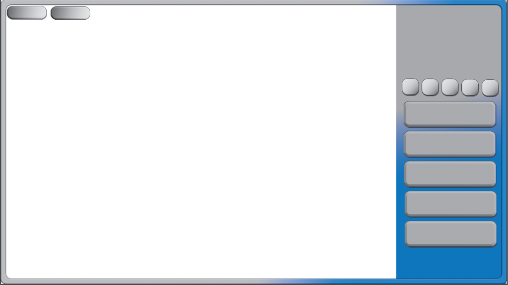
Within Adobe Illustrator I created this layout for my Cookie Clicker Prototype game. The game is mainly made up of UI elements that the player will control and manipulate in order to improve their score.
To create my first button I started by creating a square using the shape tool and Dragged on the edges to give them a more rounded look. Next I Selected the effects and added a Bevel to the buttons to make them look 3D and give them some depth and style.
I also added a shadow by duplicating the button, changing the colour and transparency and then positioning it behind the original. Once they were grouped together they moved as one button. They also have a small black outline to help them standout on the grey and blue background.
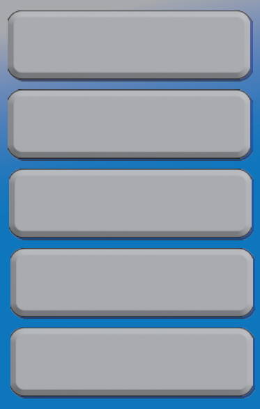
I created a few buttons in slightly different style encase I had to tweak their design later or some worked better in game then others. I then designed a border for my game and duplicated my buttons to get a sense of what they might look like in game and how I could possibly position them.
Reflection:
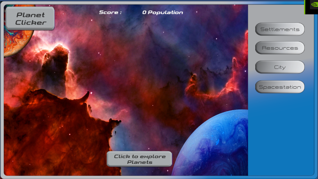
Personally I think that the UI works with my Sci-fi style of the game I created, Whilst it isn’t perfect and I know there are some changes I would like to make most notably the Bottom Button that the player clicks to Increase their population (score). I had created a planet button so the player would click on a planet but when I added this into Unity, The button no longer worked as intended so I had to drop it from the final desing.
The colours work well with the style and help the UI standout from the photo bashed background image.
References:
Olah, D. (2018) Planet in space [Photograph]. Available Online painting of planet photo – Free Planet Image on Unsplash [Accessed 25/10/2022]
Feyissa, S. (2021) Blue planet on black background [Photograph]. Available Online blue and white abstract painting photo – Free Space Image on Unsplash [Accessed 26/10/2022]
NASA (2016) Space Nebula [Photograph] . Available Online Nebula photo – Free Space Image on Unsplash [Accessed 25/10/2022]